Analyzing Tweets During a Political Debate
Due (graduating students): Friday, December 4 at 12pm
Due (non-graduating students): Wednesday, December 9 at 12pm
The purpose of this assignment is to use many of the skills and concepts you have seen throughout the quarter. Although the ultimate result is a series of graphs, you will have to read and process data in interesting ways before you can generate the graphs. You may work alone or in a pair for this assignment.
Introduction
During a major event, such as a political debate, Twitter can be an interesting source of data: What candidates are getting the most attention? Where there any shift in trends before and after the debate? Are there any spikes in interest in a specific candidate throughout the debate? etc. In this assignment, you will be using a large dataset of tweets collected during the September 16 Republican debate to answer these kind of questions.
Data
On September 16, 2015, CNN hosted the second Republican debate leading up to the 2016 Republican primaries. The prime time debate took place from 5pm to 8pm (PDT) and included Jeb Bush, Ben Carson, Chris Christie, Ted Cruz, Carly Fiorina, Mike Huckabee, John Kasich, Rand Paul, Marco Rubio, Donald Trump, and Scott Walker.
The dataset you will work with includes 1,925,359 tweets collected in the 51 hours between September 15 at 5pm (PDT) until September 17 at 8pm (PDT). I.e., starting 24 hours before the debate, and lasting until 24 hours after the debate. These tweets were collected by connecting to Twitter’s public API, and requesting a feed of tweets containing the Twitter username or full name of a GOP or Democratic candidate.
The list of GOP candidates included all the primetime candidates, the candidates who participated in the undercard debate (Bobby Jindal, Lindsey Graham, Rick Santorum, and George Pataki), as well as Jim Gilmore, who did not qualify for the debate, and Rick Perry, who qualified but dropped out of the race a few days before the debate. The list of Democratic candidates includes Lincoln Chafee, Hillary Clinton, Martin O’Malley, Bernie Sanders, and Jim Webb.
Even after filtering the Twitter feed to include only tweets that mention these candidates, there were likely many more than 1,925,359 tweets posted in the 51 hours during which we collected the tweets. Twitter’s public API does not give access to the aptly named “firehose” with all their tweets. Instead, it provides a sample of tweets (but still enough to get interesting results from the data).
The raw dataset (including the text of each tweet, information about the user for each tweet, information about who retweeted and favorited each tweet, etc.) is nearly 10GB large, so we distilled the data into a CSV file with one row per tweet and the following fields:
seconds: The time at which the tweet was posted, in seconds since the data collection started. The values in this field are mostly, but not always, in increasing order (however, this will only be relevant for the last task, and we include an extended discussion of this issue there).length: The length of the tweet.candidates: The candidates mentioned in the tweet. This is a list of candidate identifiers separated by vertical bar characters. For example, if Donald Trump, Jeb Bush, and Hillary Clinton were mentioned in the same tweet, the value of this field will betrump|bush|clinton(the identifiers do not appear in any particular order). However, if only Donald Trump was mentioned, the value would betrump.Note: If a tweet contains multiple mentions of the same candidate, this candidate will only appear once in the
candidatesfield. i.e., if a Tweet mentions Ted Cruz three times and Rand Paul once, the value of the field will becruz|paul(notcruz|cruz|cruz|paul).The provided code includes a series of variables that can be useful when processing this field:
CANDIDATE_NAMES: A dictionary mapping candidate identifiers (as they appear in thecandidatesfield) to candidate names.GOP_CANDIDATES: A list with the candidate identifiers of GOP candidates.DEM_CANDIDATES: A list with the candidate identifiers of Democratic candidates.ALL_CANDIDATES: A list with the candidate identifiers of all candidates.
retweet: If this tweet is a retweet of a tweet posted by a candidate, the value of this field will be the candidate identifier (as described in thecandidatesfield). If it is a retweet of another user, the value of this field will beother. If it is not a retweet, this field will be blank.when: Can take only three values:-1: The tweet took place before the debate.0: The tweet took place during the debate.1: The tweet took place after the debate.
polarityandsubjectivity: The polarity and subjectivity of the tweet, as determined by a basic sentiment analysis performed with the TextBlob library. Polarity ranges from -1.0 (negative sentiment) to 1.0 (positive sentiment, and subjectivity ranges from 0.0 (very objective) to 1.0 (very subjective).longandlat: For geocoded tweets, the longitude and latitude from where the tweet was posted. Please note that a relatively very small number of tweets (1,942) include this information.
Even when we reduce the dataset to only the above information, the CSV file with all the tweets (tweets.csv)
is still 82MB, which can take a while to load. So, we also provide a file (during.csv) that contains only the tweets
during the three hours that the debate took place. This file is 21MB and we recommend you use it when developing
your code, and only switch to the tweets.csv file once your code is nearly done.
Note: In this assignment, you will only need to use the seconds and candidates fields. You can ignore the rest
of the fields, although you’re welcome to play around with the rest of the fields.
Note (2): If you would like access to the original raw dataset to perform more elaborate analysis on your own, please let us know.
Your tasks
You will be writing code to produce a series of plots using the Twitter dataset.
All your code will be in a file called debate_tweets.py. This is a program
that takes a single command-line parameter: the CSV file with the Twitter data
(we provide the code that gets that command-line parameter). For example,
the program should be run like this:
python3 debate_tweets.py data/tweets.csv
The program should then generate several PNG files inside the output directory
(the tasks below specify the names of the PNG files, and the plot that each should contain).
Your code should not print anything, nor open any matplotlib windows (i.e., your code
should not call matplotlib’s show() function;
you should instead use savefig() to save the plots to a file).
While we provide some basic code
to get you started, the overall structure of the code is entirely up to you.
You should pay special attention to the function decomposition of the tasks. In particular,
you must not write all your code in the __main__ block of
the program. Instead, you should write functions that implement each task, and call those
functions from the __main__ block.
Also, although the ultimate result of your code will be a series of plots, you will have to write a fair amount of code that is unrelated to plotting (in fact, the majority of the code you write should be unrelated to plotting). So, as you work through these tasks, focus first on producing code that obtains the data you are going to visualize, and then write the plotting code for it (instead of trying to write plotting code directly).
Some of the plots we will ask you to do have not been covered in class. This is by design: one of the goals of this assignment is for you to be able to read and use external documentation. So, when figuring out the plotting code, you are allowed (and, in fact, encouraged) to look at the Matplotlib documentation and the Matplotlib gallery. Not just that, any code you find on the Matplotlib documentation can be incorporated into your code without attribution. However, if you find examples of Matplotlib graphs elsewhere on the Internet, and use that code either directly or as inspiration, you must include a code comment specifying its origin.
When working on the plotting code, it is important that you do not obsess over making your plots look exactly like ours. You should focus on the following:
- The data being shown is correct (i.e., the same as shown in our plots)
- The axis titles and labels are the same as in our plots.
- The plot title is the same as in our plots.
- If our plot includes a legend, so should yours.
Your plots should look substantially similar to ours, but they don’t have to match our plots pixel by pixel. We will not deduct points if the colors or font sizes are different, if the order of the entries in the legend are not the same, etc.
Task 0: Reading the data
Before you can start analyzing and visualizing the data, you must read the whole dataset from the CSV file. Your must write code that reads in all the data from the CSV file only once. If you read the file more than once (specially if you do this in each of the following tasks) your code will run very slowly, and we will deduct points.
The exact manner in which you read the data is up to you, but you may find it useful to create a class that
encapsulates information about each individual tweet. In particular, you will be working with the
candidates field quite a bit; you may want to convert it to a more convenient representation than
the string representation found in the CSV file.
Task 1: Number of candidate mentions per tweet
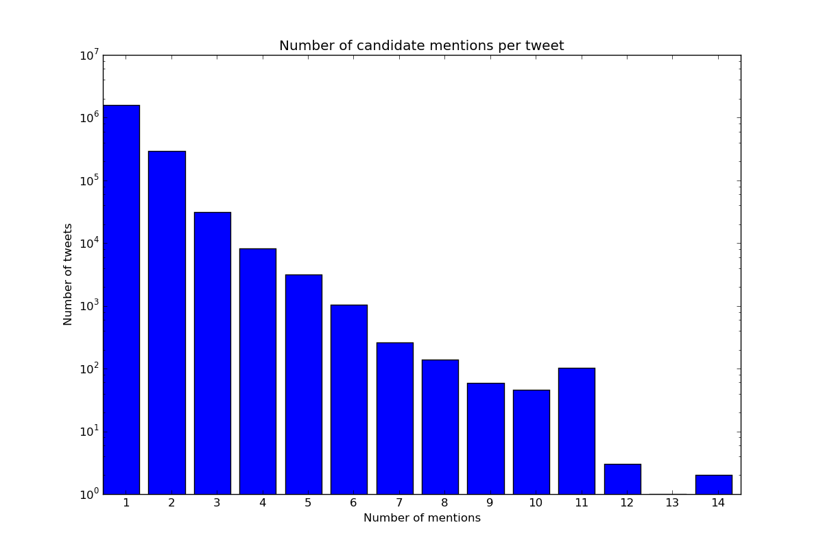
Each tweet mentions at least one candidate. You must produce a bar plot that shows the number of tweets that mention one candidate, two candidates, etc. Using the complete dataset your graph should look like this:
Using the during.csv dataset, it would look like this:
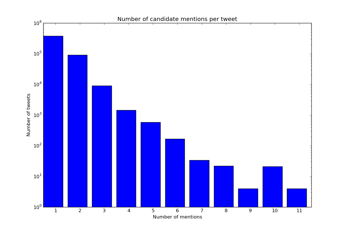
You must save this graph as bar_num_mentions.png. Note that the Y axis uses a log scale.
As noted earlier, you should avoid going straight to writing the plotting code. In general, you should try to cleanly separate the code that does the data analysis and the code that does the plotting. For example, in this task, it can pay off to first write a function that computes the data you are going to plot, and informally check whether it produces results that make sense before you start writing the plotting code.
Similarly, it can also pay off to have a function that focuses only on generating the plot starting from the processed data produced by the function described above (instead of having the plotting function operate on the whole dataset). This can make it easier for you to informally test your plotting function, separately from whether the data analysis is correct or not.
We encourage you to follow this approach in this task and all subsequent tasks.
Task 2: Pairs of candidates most frequently mentioned together
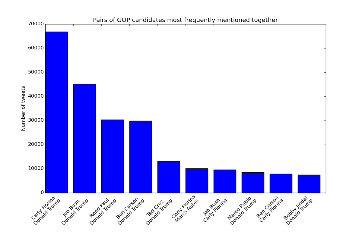
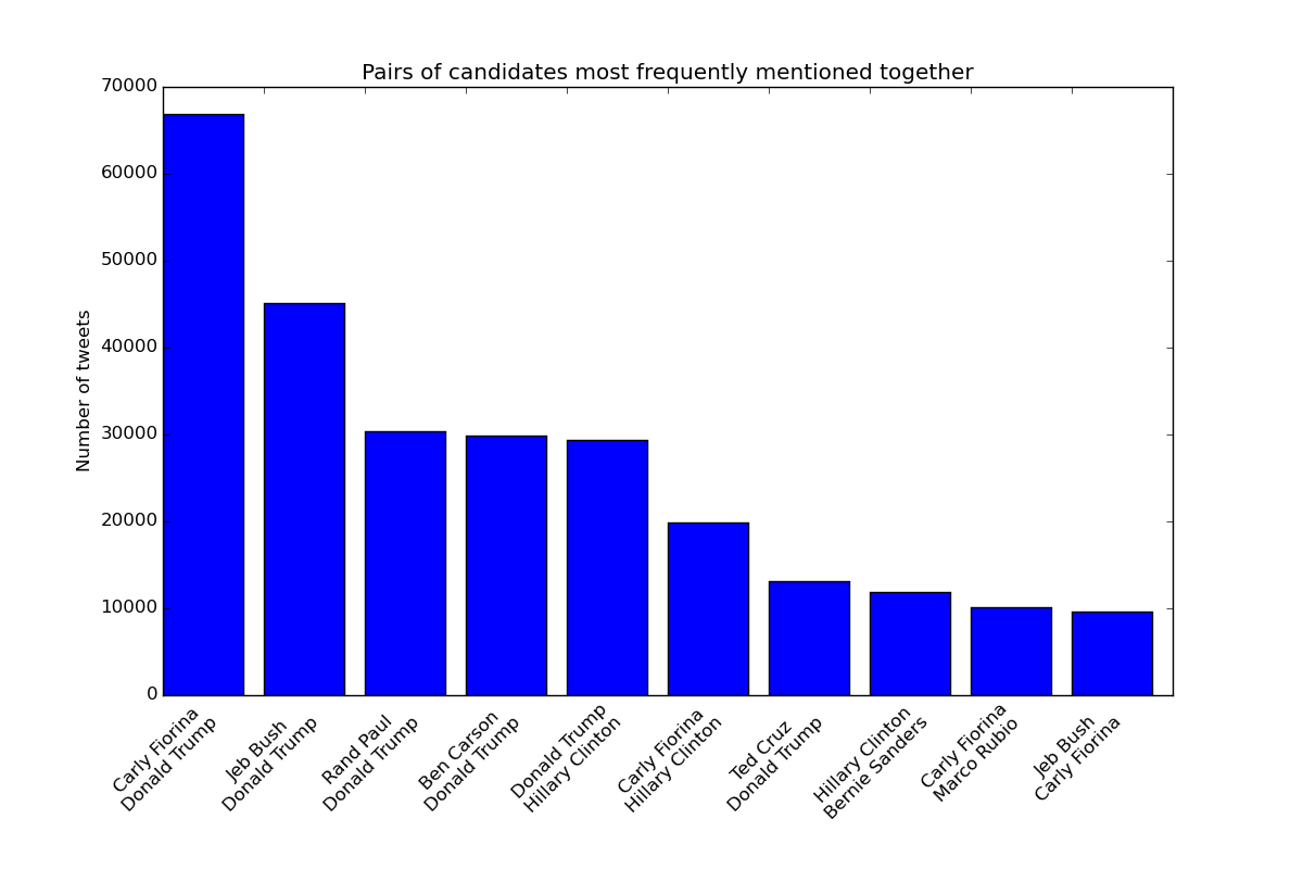
As we can see in the previous plot, there are a large number of tweets that mention two or more candidates. You must produce a bar plot that shows the top ten pairs of candidates that are mentioned together. Take into account that if a tweet mentions Donald Trump, Carly Fiorina, and Jeb Bush, then that tweet is considered to mention three pairs of candidates: Trump and Fiorina, Trump and Bush, and Fiorina and Bush.
You must produce two plots: one with just the GOP candidates, and one with all the candidates. Using the complete dataset, these graphs would look like these:
Using the during.csv dataset, they would look like this:
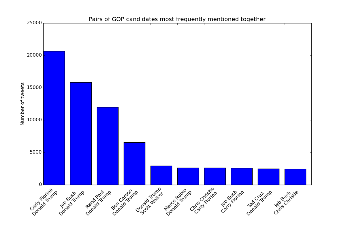
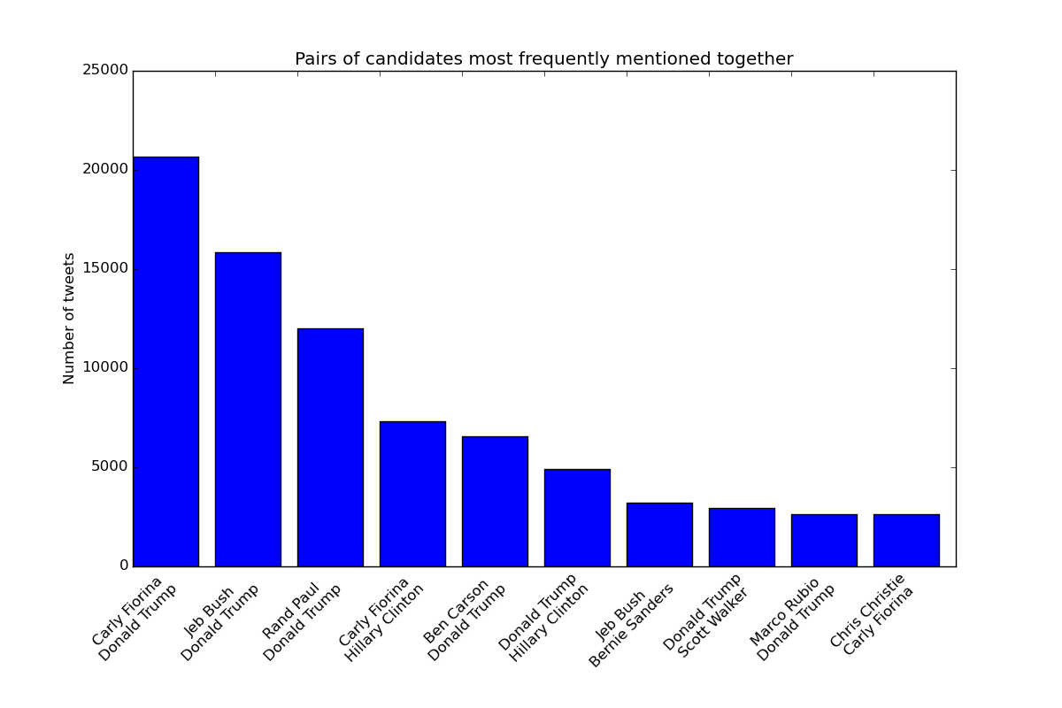
You must save the GOP graph as bar_candidates_together_gop.png and the
other graph as bar_candidates_together_all.png
Note: The order of the names in a given pair is not important. You should make sure that you get the pairs and amounts right, but it doesn’t matter if your graph shows a given pair in a different order than we do.
Task 3: Percent of mentions per candidate
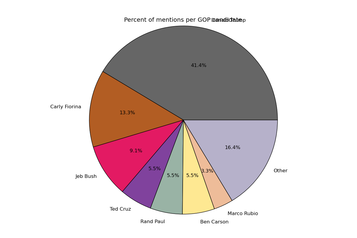
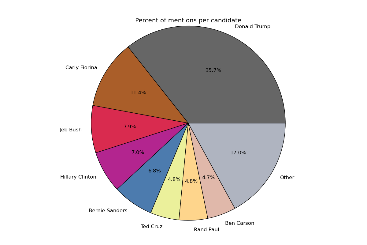
You will produce a pie chart with the percentage of mentions that each candidate has gotten. All the candidates with less than 3% of the mentions will be lumped into an “Other” category in the pie chart.
Take into account that we are concerned here with the percentage of total mentions, not the percentage of the total number of tweets. Since many tweets mention more than one candidate, the number of mentions will be greater than the number of tweets.
You must produce one pie chart with just the GOP candidates, and one pie chart with all the candidates. Using the complete dataset, these charts would look like these:
Using the during.csv dataset, they would look like this:
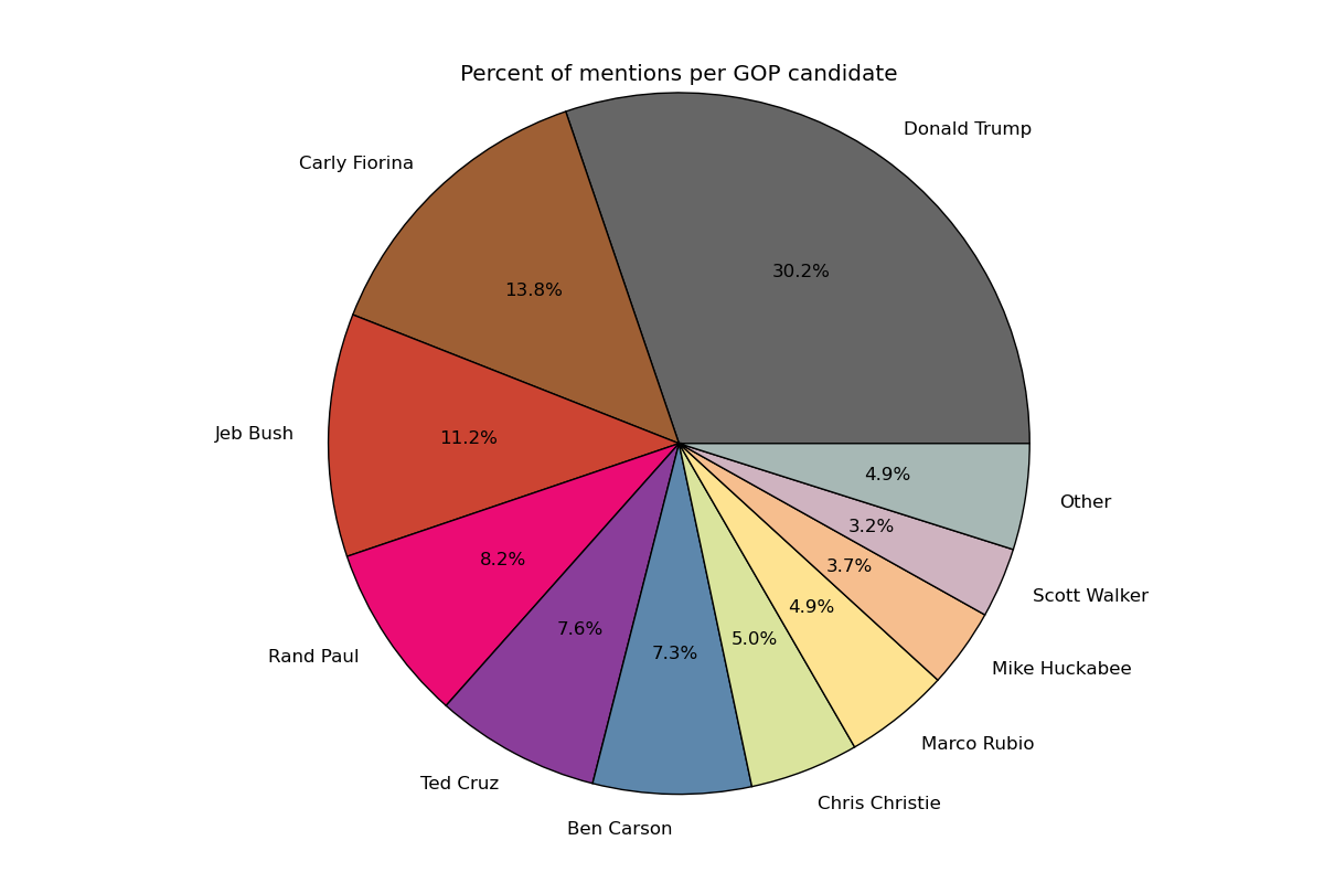
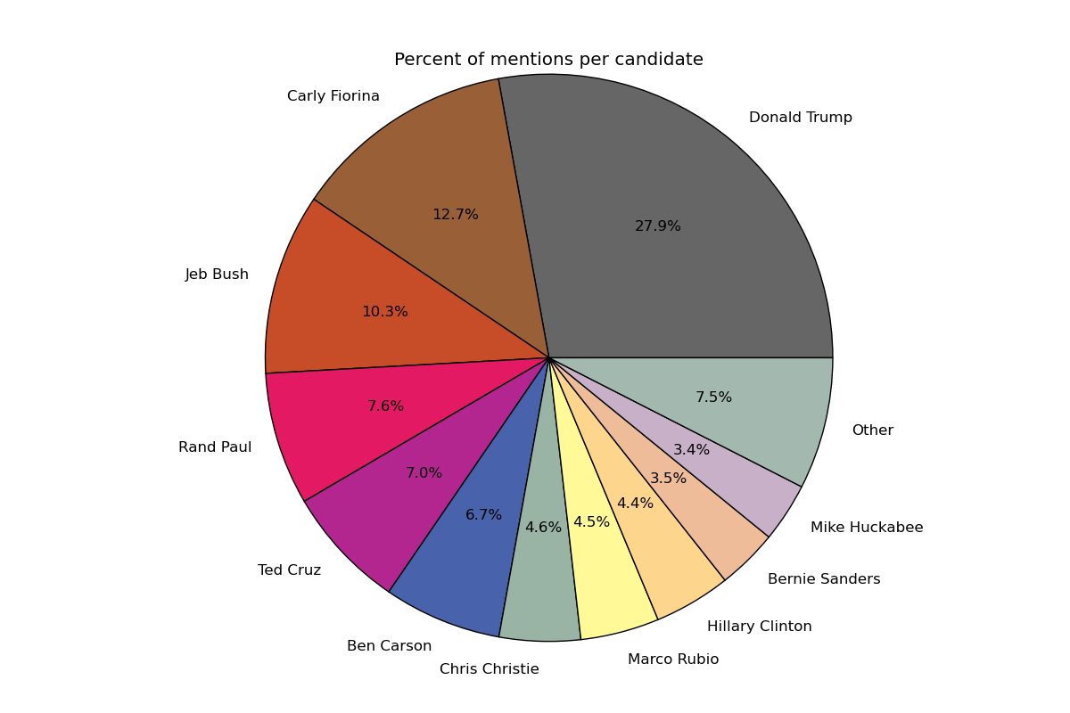
You must save the GOP chart as candidates_gop.png and the
other chart as candidates_all.png
Note: The slices of the pie should be ordered from largest to smallest, with the “Other” slice coming after the smallest slice. The exact position of the slices is not important, as long as they appear in the correct order.
Task 4a: Mentions per minute
You will produce a graph that shows the number of mentions per minute for several
candidates during a specific period of time. A slight complication in computing
the number of mentions per minute is that the seconds field in the dataset
is not always in order. For example:
5.0,paul|carson,-1,0.6,1.0,,
5.0,carson,-1,0.0,0.125,,
5.0,trump,-1,0.175,0.8142857142857143,,
6.0,trump|carson,-1,0.0,0.0,,
5.0,trump,-1,-0.8,0.9,,
6.0,trump,-1,-0.3333333333333333,0.6666666666666666,,
6.0,trump,-1,0.0,0.0,,
6.0,trump,-1,0.0,0.0,,
So, when checking whether to count a tweet as part of one minute or another,
it is not enough to check whether the seconds field has increased by one.
Note: You cannot solve this issue by sorting the dataset. You must come up with a solution that requires making a single pass through the tweets to compute the number of mentions per minute.
You will generate a graph that shows the number of mentions per minute for Donald Trump, Carly Fiorina, Jeb Bush, and Ben Carson only during the debate. This graph will look like this:
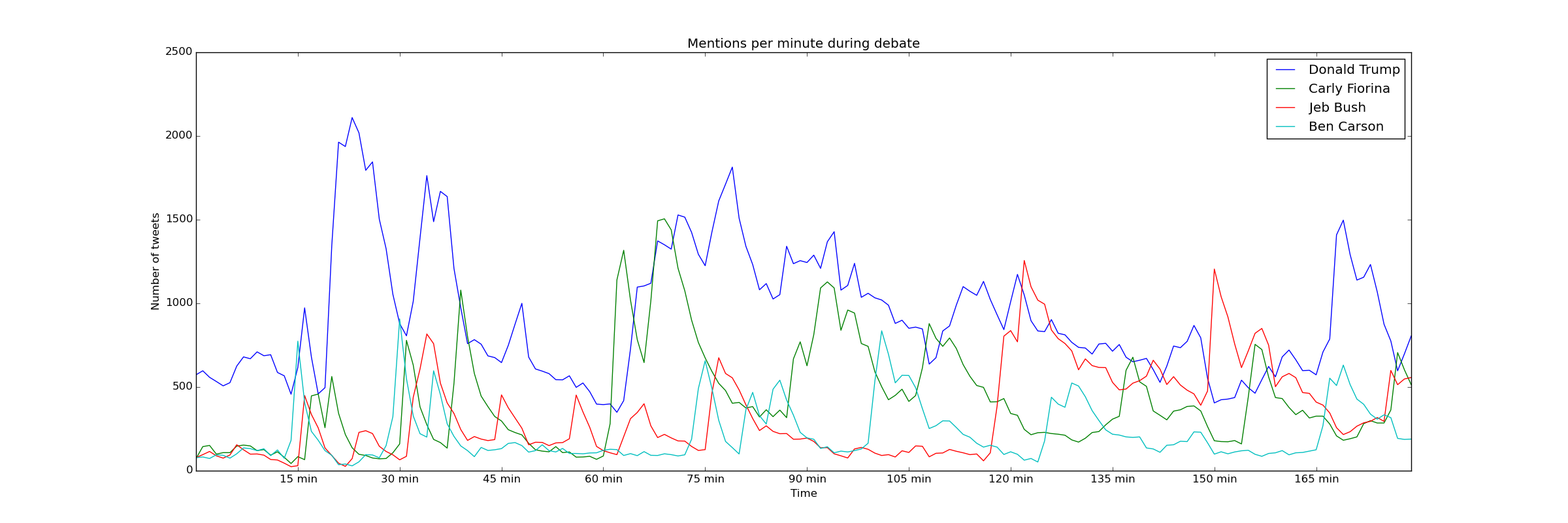
You must save this graph as mentions_over_time_during.png
You will also generate a graph that shows the number of mentiones per ten minutes for the same four candidates throughout the entire dataset. This graph will look like this:
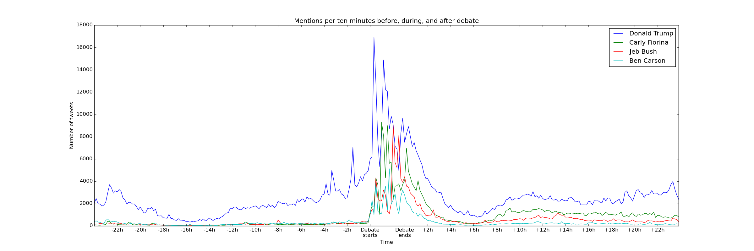
You must save this graph as mentions_over_time.png
Using the during.csv dataset, the graphs would look like this:

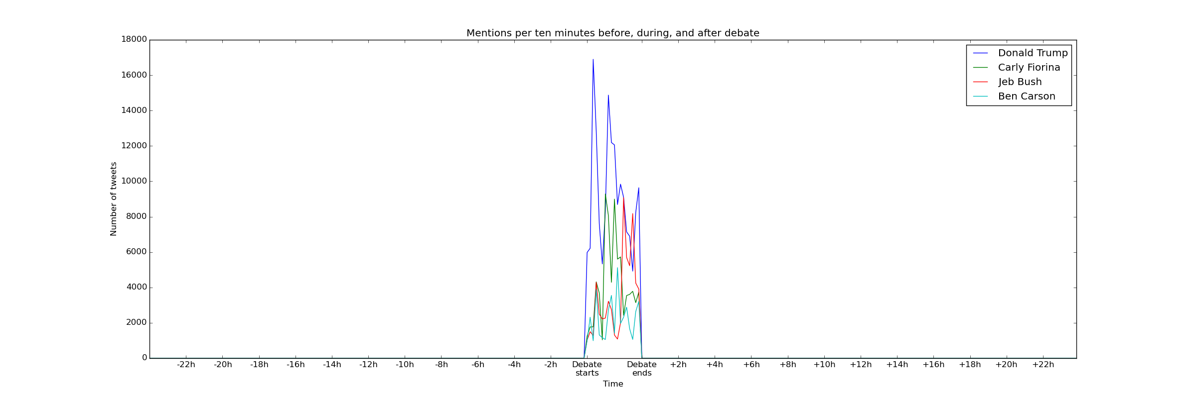
Note: Getting the axis labels right in this task (and task 4b) can be tricky. While you will only get full credit if you can produce the right axis labels, we will be assigning very few points to these axis labels. Getting the axis labels in this task perfectly right should be the very last thing you do in this assignment, and you should skip doing it if you run out of time.
Task 4b: Percentage of mentions over time
You will produce a graph known as a stackplot that shows the percentage of mentions per unit of time for each candidate. In other words, you must compute the number of mentions for each candidate during a unit of time and, instead of visualizing the absolute number of mentions, you will visualize what percentage of mentions each candidate got.
The graph you will produce will only include Donald Trump, Carly Fiorina, Jeb Bush, Ben Carson, Ted Cruz, Rand Paul, and Marco Rubio, and will show the percentage of mentions per ten minutes throughout the entire dataset.
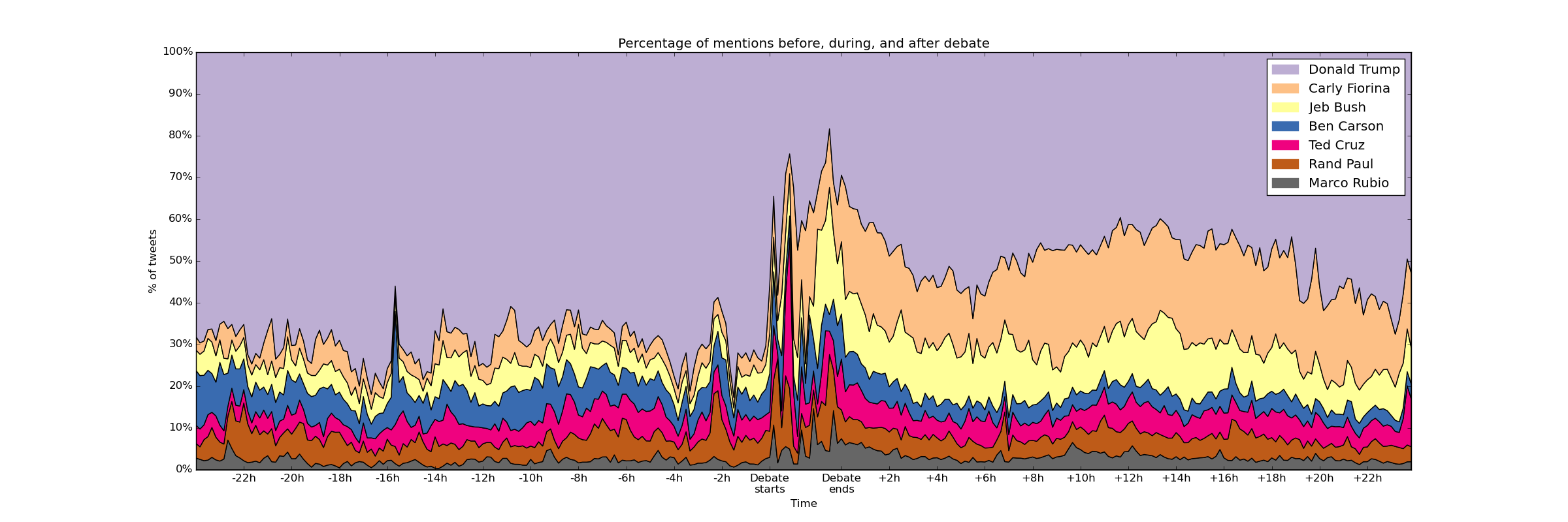
You must save this graph as stackplot.png
Using the during.csv dataset, the graph would look like this:
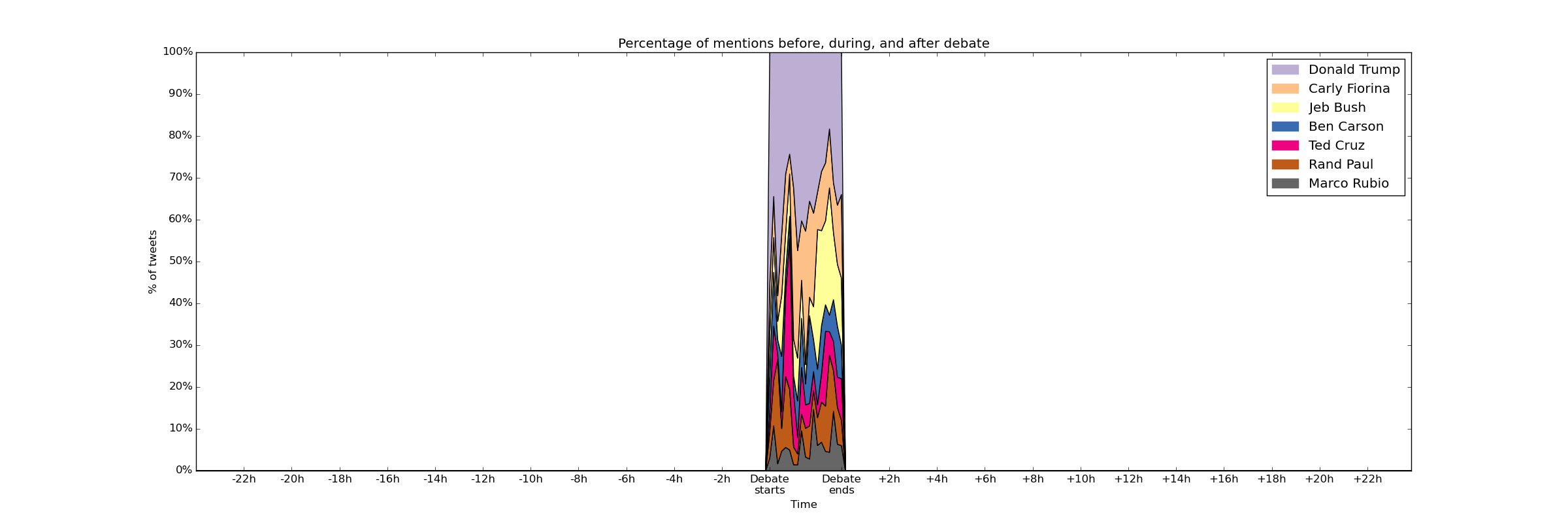
Take into account that you are computing the percentage of mentions just for those seven candidates, not the percentage of mentions of all candidates. In other words, at each interval of time, the percentages of the seven candidates we are including should always add up to 100%.
Hint: If you followed our advice to cleanly separate the code that does the data analysis and the code that does the plotting, your code for this task should be able to re-use most of the code from Task 4a, and focus mostly on producing the stackplot.
Getting started
Follow these start-up instructions if you plan to work alone.
Follow these start-up instructions if you are going to work in with a partner you have worked with previously.
Follow these start-up instructions if you are going to work in with your chosen partner for the first time.
Here is a description of the contents of the pa7 directory:
debate_tweets.py– you will write all your code in this file. Note that this file includes several constants and a function that you may find useful. All of them are documented with code comments, and you should make sure to read and understand them before you start writing your code.data/– a directory for the data files. Since the data files are very large they are not included in the Git repository. See below for instructions on how to obtain the data files.output/– an empty directory where you will generate the PNG files with the plots.
The data/ directory contains a file called get_files.sh that will download the data
files. To download the data files, go into the data directory and run this:
./get_files.sh
This will download files tweets.csv (the complete dataset) and during.csv (with
only the tweets made during the debate).
Before you start working on your code, make sure that Matplotlib is installed on the VM. There was a Piazza post a long time ago asking you to do this, but it was only required if you wanted to see the plots on Lab #2 so, in case you didn’t install Matplotlib at the time, make sure you run the following:
sudo apt-get update
sudo apt-get install python3-matplotlib
Submission
Follow these submission instructions if you are working alone.
Follow these submission instructions if you are working in a pair.
Remember: If you are graduating this quarter, your deadline is December 4th, not December 9th!
If you are not graduating this quarter, please note that chisubmit will first be set up with a December 4th deadline. Once all the graduating students have submitted their assignments, we will adjust the deadline. If you try to submit in the 24-48 hours after the December 4th deadline, chisubmit may tell you to use an extension (don’t do this; just wait until we’ve set the deadline to December 9th).